Charts like the one below are becoming more and more common in newspapers and magazines, but not everyone understands what information they actually show. This one is based on research that was used in the recently published report from the Intergovernmental Panel on Climate Change (Brohan, 2006). Temperature is shown in tenths of a degree on the left-hand (Y) axis and time on the bottom (X) axis.
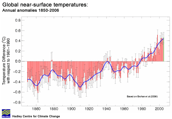
There are no prizes for guessing that the wavy blue line relates to the global temperature since 1850, or that it shows an overall rise in temperatures. We can also see that there was a certain amount of variation in temperatures during the 19th C, but without any particular trend either up or down. From about 1910 onwards, temperatures rose until the 1940s, when the trend reversed sharply and it got cooler. From about 1975 until the end of the century there was another upward surge comparable to the one at the beginning of the century, then the line begins to level off at the present time. It all looks pretty dramatic and, some might say, scary.
So if it has become warmer since the end of the 19th C, then just how much warmer? According to the IPCC this is the amount: 0.6° C ± 0.2. In other words just over half a degree centigrade (about 1° F) but with an uncertainty of 0.2° C or one fifth of a degree. These are pretty small numbers in terms of seasonal variation, given that temperatures, even in the fairly gentle climate of the UK, can easily range between 30° C and minus -10° C. If you were sitting in a room with no clothes on and the temperature suddenly changed by 0.6° C, it is most unlikely that you would notice that anything had happened. It takes a pretty accurate thermometer to measure tenths of a degree centigrade.
The level of uncertainty is very interesting because, although these figures refer to just fractions of a degree, they are very large in proportion to each other. The expression ± 0.2° C indicates that the figure of 0.6° C may in fact be as little as 0.4 °C or as much as 0.8 °C or anything in between. Put another way, the uncertainty is equivalent to a third of the stated temperature increase. The figure of 0.6° C is just the best guess within quite a rather wide range of possibilities.
This is a very large degree of uncertainty indeed, and indicates that global temperatures, even during the recent past, cannot be estimated with a high degree of accuracy. It’s rather like going into a deli and asking for 600gms of lentils, then finding that their scales are so inaccurate that there is no way of knowing whether you will get 400gms or 800gms for your money. The wavy blue line is, therefor, an estimate of what scientists think might have happened since 1850.
Now we come to the red bar lines that underlie the blue temperature line. At a glance, it might seem that these too represent temperature, but they do not. In fact none of the information on this chart shows actual temperatures, it only represents statistical data that is concerned with the extent to which temperature has changed.
A clue to what’s going on is provided in the small print under the chart title where it says Annual anomalies 1850-2006. What the author has done is take an average (mean) temperature for a particular period and then compared the temperatures for the whole period with that figure. In this case the reference period is 1961-90; thirty years out of the full range from 1850-2006. Then he has plotted differences between the temperature for each year and the average temperature for the reference period. Where the temperatures were lower than average this produces minus values (the red bars that extend downwards). The temperatures that are more than the average (the red bars that extend upwards) produce plus values. So what we are looking at is a rather specialised statistical construct representing differences in temperature.
You could sum this procedure up by saying that it is a way of zooming in on the variations in temperature so that they can be studied more closely. This is a very useful technique if you are a climate scientist, but it can be pretty confusing and misleading if you are not familiar with the underlying methodology. This kind of chart gives the impression of a huge increase in temperature has occurred, but as we established at the beginning of this post, the actual increase is a very small one. A straightforward temperature chart would look something like this.

As you can see, you really would need to zoom in on this quite a lot to find any evidence of catastrophic climate change. Although there is an upward trend, it is neither dramatically steep nor particularly large. You may wonder why we see a great many graphs in the media that look like the first graph – with or without the red bars – and none that look like the second one.
Test command
Re: #1
Very many thanks Dan, at least I know that it works now.
How about changing the vertical axis into degrees K ? Just add 273.2 to all the temperature values.
Then if you set the scale to run between 0 and 290 the line will look even flatter.
It can be appreciated when science, which is difficult to understand, predicts consequences which are not bourn by everyday or past experience that a certain amount of scepticsm may result.
However is your scepticism still intact after seeing this very short video?
http://www.youtube.com/watch?v=zW1JeFVCZ_Q
Re: #4
No doubt your link will interest those whose opinions are formed by eye-catching video clips on YouTube.
The research into arctic summer sea ice extent undertaken by Mark Serreze’s team at NSIDC relies on satellite imagery and therefor covers a period of less than thirty years. Comparison with conditions during the medieval warm period, when the Vikings established colonies in Greenland, or even the 1930s when temperatures comparable with those of recent years were recorded in parts of the Arctic, are impossible. Attempting to draw conclusions or make predictions based on such a short dataset would be greeted with laughter in any other branch of science.
Serreze’s findings are dramatic, and they have certainly been very useful to those who promote fear of climate change by depicting polar bears ‘stranded’ on ice flows, but they fall far short of being compelling scientific evidence of catastrophic global warming.
Good old Peter Martin,
It all depends on the start date.
http://aycu39.webshots.com/image/42758/2004893524491921913_rs.jpg
http://aycu19.webshots.com/image/44618/2004881440297032940_rs.jpg
http://aycu24.webshots.com/image/44263/2004885309439382820_rs.jpg
http://aycu19.webshots.com/image/45498/2004826913703924079_rs.jpg
http://aycu19.webshots.com/image/44618/2004813378814753617_rs.jpg
Re: #6
Welcome Bobclive, and thanks for the links. I hadn’t seen any of these before.
Are you familiar with this article which deals with the discovery of the remains of vegetation in the till under retreating Alpine glaciers?
http://www.spiegel.de/international/spiegel/0,1518,357366,00.html
It tells a similar story to your links, but over a rather longer timescale, which some alarmists must have found disconcerting as not even a climate scientist would dare produce a model where glacial ice flows uphill. Since this was published I believe that similar finds have been made in S. America, Canada, and recently in Greenland too.
It’s funny that this kind of research never seems to be mentioned by the UK media.